UI/UX, Interaction Design, Product Design
The ExatTarget Platform Development team had just recently built a new App Center for developers and introduced it to a small dev group during our 2012 Connections User Conference. Response was very positive and interest was high so the Platform Dev Manager asked if I could review it and give some suggestions on design improvements. I asked for some credentials and began to take a look. Once I started digging in, I quickly realized that there were A LOT of usability issues. I needed to do a heuristic evaluation to track and document my findings and determine next steps for the team.
BACKGROUND INFORMATION
WHAT IS THE APP CENTER AND WHAT DOES IT DO?
The App Center is a place where developers could go to manage their API keys for server-to-server applications, Hub Exchange applications (think Salesforce App Exchange), and mobile applications for the Marketing Cloud MobilePush channel app. Developers could also publish applications to the Hub Exchange that they had created. This was all part of a larger Platform development effort to roll out the new 2.0 version of Fuel UX UI element library, SOAP APIs and the Fuel API Family through the code.exacttarget.com domain.

Landing page for the App Center

WHAT IS CODE@EXACTTARGET.COM?
Code@ExactTarget.com is a place where developers can get information and resources on Fuel UX, the Fuel API Family, SOAP API's, AMPScript and ask questions or vote for answers (similar to Stack Overflow). 

Landing page for Code@ExactTarget

I then met with my UX Manager, Platform Development Manager and Product Manager to discuss and agree to doing a Heuristic Evaluation on the App Center. I then started the process of the evaluation.
My contributions included the following: 
1. DETERMINING HEURISTICS
I began researching different heuristics and methods to determine the best approach. I looked at three different methods: 10 Usability Heuristics for User Interface Design by Jakob NielsenGerhardt-Powals’ cognitive engineering principles and the Weinschenk and Barker classification.
I chose the 10 Usability heuristics for User Interface Design because they are the most widely used and provided the best heuristics that I needed.
2. EVALUATION AND RECOMMENDATIONS
I began by grabbing screenshots of all the App Center screens and started to jot down some notes as I progressed so I could reference later.
METHOD/APPROACH
The App Center application was examined using known usage scenarios. These included:
- User Account registration
- Login and access after approval
- Creation of the three primary types of application API key management process:
1. Server-to-Server integration applications
2. Hub Exchange applications deployed to the Interactive Marketing Hub
3. Mobile applications for the MobilePush IMH application.
Because the App Center was built upon the Fuel UX platform, this application was also evaluated for consistency and adherence to established IMH application UI patterns, guidelines and standards.
Each component or screen was evaluated against the heuristics by providing a list of user interface or user experience issues that were discovered, along with recommended solutions to correct the issues. The heuristics were then scored or prioritized by level of severity (1 to 5) where 5 is the most severe and mapped to each issue.
FINDINGS/RECOMMENDATIONS
A few of the key findings and takeaways: 
The App Center was WILDLY different than any of the Fuel UX standard components, workflow processes or design guidelines we were using on all of our other IMH applications.
There was no context for the user once they landed on the App Center and very little to no help or documentation about the how to use the App Center.
Lack of ability to edit app information after it had been created. App object-level management was needed.
Poor usability around error handling and didn't conform to Fuel UX standards.

App Center landing page heuristic issues and severity levels.

Error state heuristic issues and severity levels.

Because the workflows needed a great deal of improvement, I began sketching out some improved flows that I would include in the recommendations of the evaluation.

Sketch of the Create Hub Exchange app process

As I began to sketch them out, I then quickly put together some Lo-Fi flows in Adobe Illustrator for much of the App Center functionality. These recommended flows would prove to be key to the evaluation and determining next steps for where the development team would need to focus efforts.

Current vs Recommended Flows for Creating a Server-to-Server App integration
Includes representations of Fuel UX components, A new App Center Home and a Management grid to launch the create processes and allows access to an editable object.

Current vs Recommended flows for the account creation process. Includes removing change password screen and going straight to registration, better notifications with direct links to login and a new App Center landing page after registration. 

3. PRESENTATiON OF FINDINGS to the UX Team
Once I had the heuristic evaluation in a draft state and most of my new flow recommendations sketched out, I presented to our UX team during a lunch and learn. The feedback was extremely positive and the team was on board with my recommendations and updates. It had suddenly become apparent that what started out as just an ask for feedback from the Platform team was now becoming a much bigger UX project and effort. This work was just the beginning and was starting to lean towards a new full-time project for the UX team. 
4. presentation of findings to the platform team
I then presented my evaluation and findings to the platform team to discuss usability issues and the recommended flow changes.  The response was overwhelmingly positive and the team was very impressed that I went above and beyond just the heuristics and had thought out workflow improvements as well. We began talking about getting a dedicated design resource to help the platform team implement my recommendations. 
We came up with a loose plan for the App Center around level of effort for a V1 design:
- Create a new App Center Overview
- Create new flows and designs for App Center Wizard
- Create designs for Edit Process
- Create a new App Center Administration area for integrated accounts
This spurred more discussion for additional design needs and a V2 design effort:
- App Center Permissions
- Updates to Account Profile
- Creating install packages

Sketches with the Platform team for V1 updates to a new Overview grid where users could manage app creation and objects.

View App Center Sketches

Sketches with Platform team for detail/object page-level ideas for V1

View App Center Sketches

5. OUTCOMES
I met with my UX Manager and UX Director to discuss my own design priorities and the amount of feedback I had received from the Platform team for their growing design needs. We shifted my priorities to focus on getting some of the flows refined and continue discussions with the Platform team on V1 design efforts. 
KEY OUTCOME
With the amount of work increasing across our team and the new developments forming on this project, we decided to open a new rec to hire a dedicated designer to support the Platform team. This was a big win for our team because we had not been involved with the platform team at all from a design standpoint. This was the beginning of a new partnership between UX and Platform that is still strong today.
6. further updates
I continued to refine the flows with the Platform team and began some concept level designs around the integration process with the Marketing Hub Exchange as well as creating an Edit/Object flow.

Server-to-Server App Flow. One of several create flows I refined with the Platform team.

View App Center Create Flow Refinements

Edit /Object-level Flow for App Center

View App Center Create Flow Refinements

Quick and dirty concept WF I created for the object page
We hired a new design resource for this project and I remained involved by on-boarding him to get him up to speed on progress. I continued to work with him to help build the relationship with the Platform team and get UX more integrated into their processes.
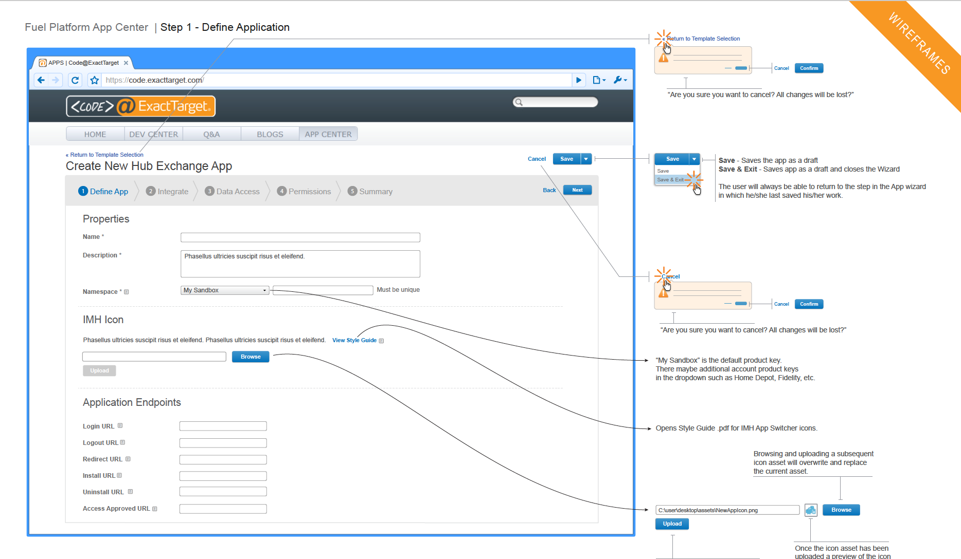
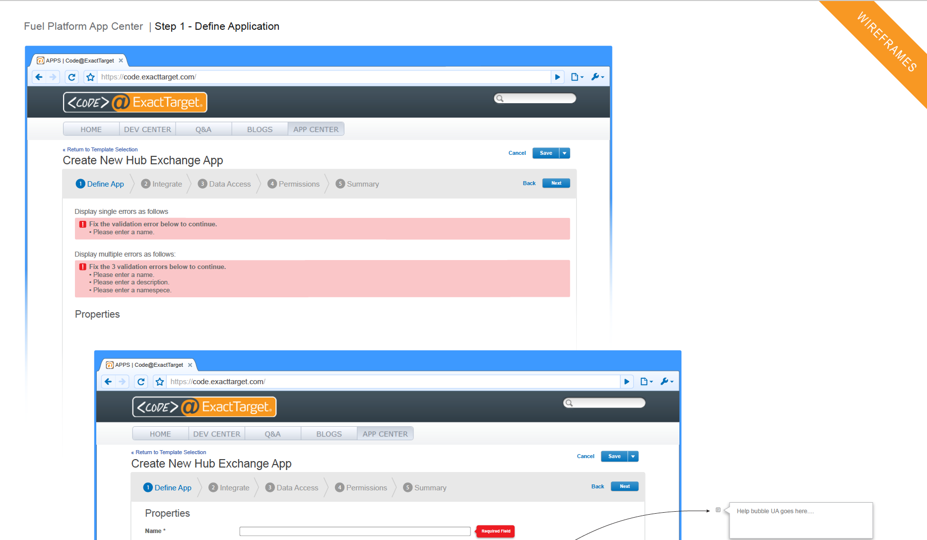
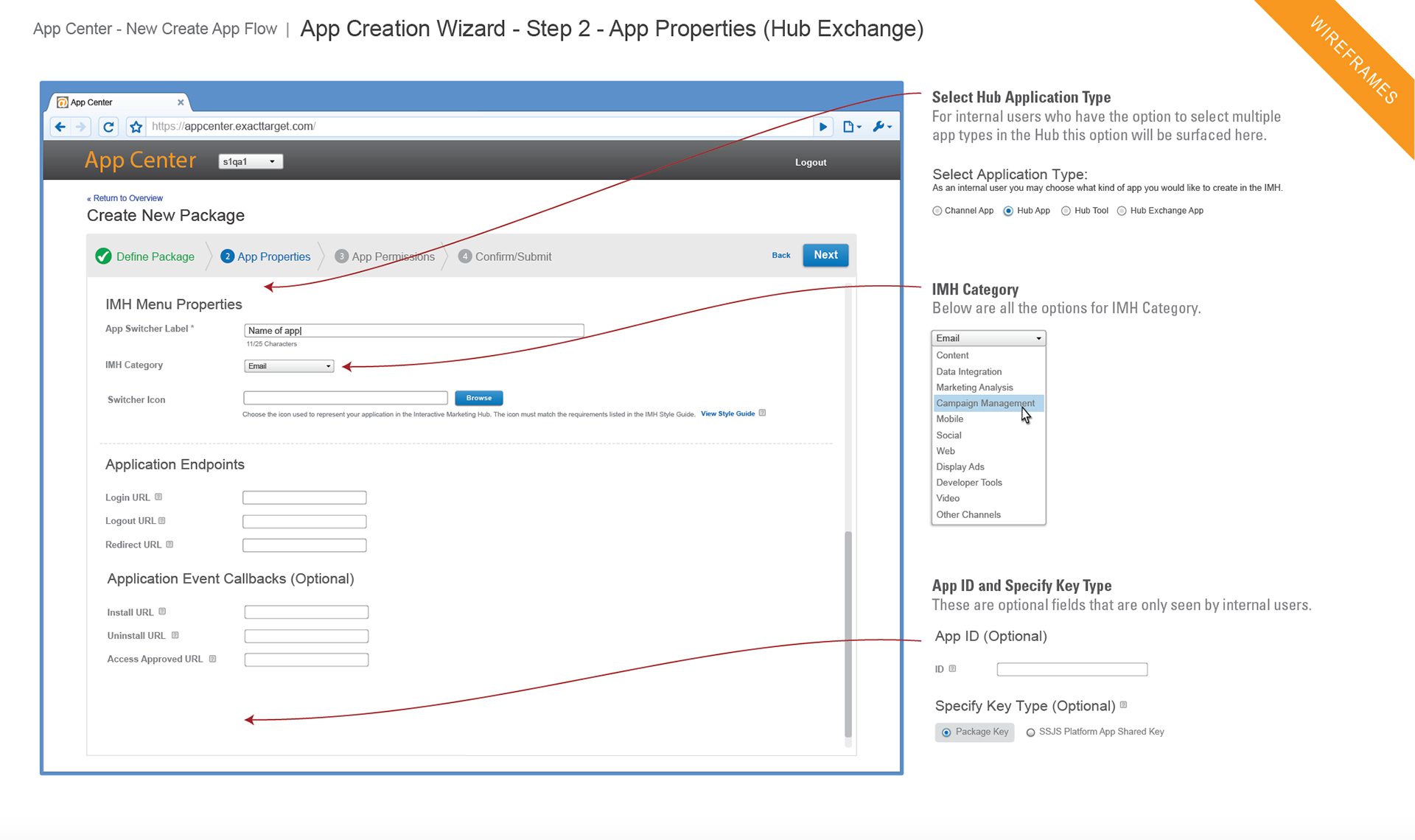
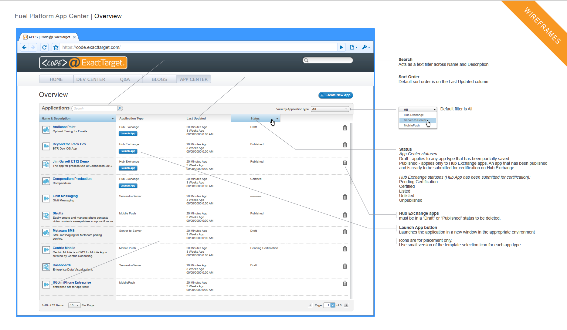
The App Center had undergone several changes and updates over time. Here are some detailed designs that I worked on with our new UX Designer that show how my initial flows had begun to take shape:
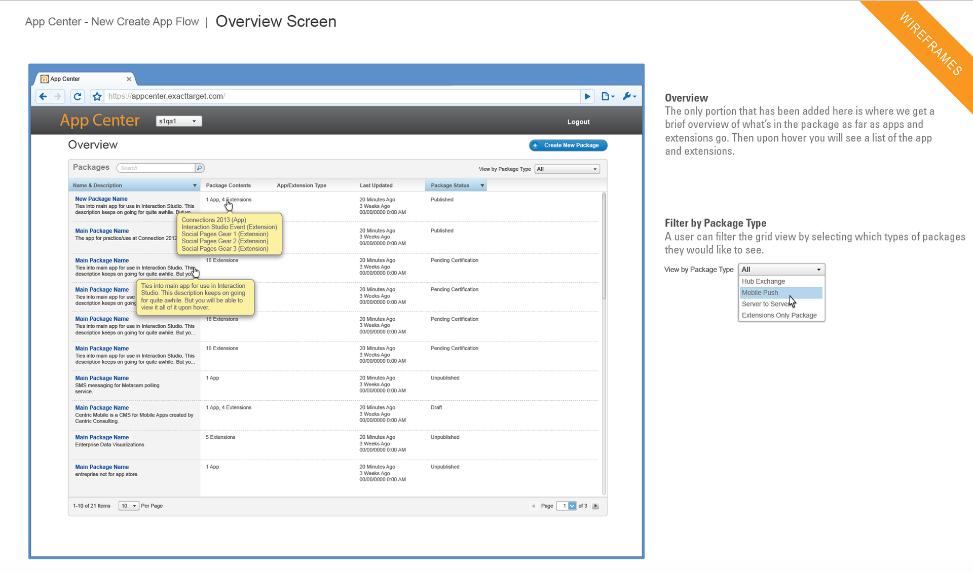
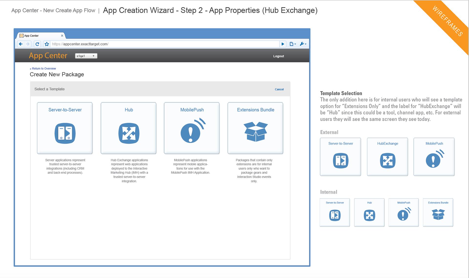
Detailed wireframes for the App Center Overview grid, landing page for creating an app and the first couple steps of the creation wizard process.
And finally, here is a more refined set of detailed designs that our UX Designer produced after I had shifted to other projects and things had begun to ramp up with the Platform team:
More refined detailed wireframes for the App Center grid overview, landing page and create wizard process.
Back to Top