UI/UX, Interaction Design, Web Design/Development, Graphic Design

I worked with a UX Researcher, Developer and Product Manager to redesign and launch the ExactTarget Trust Site as a limited beta to get user feedback and then launch GA. The purpose of the current site was intended to help ExactTarget admin users monitor real-time system performance and maintenance windows (primarily DB system down/up times) so they could understand the health of their systems and be better informed.
MY CONTRIBUTIONS
- Led collaboration of design efforts with research, product and development throughout project
- Concept Designs > Invision prototype for user testing > to final Visual Design for implementation
- Creation of the Trust ExactTarget logo
- Custom graphics/iconography
- Custom design of controls, wells/containers, information and data displays
- Support for researcher on script, questions, running user session, note taking and analysis
- Adherence to corporate branding and implementation into all UI elements
- Built out html templates and css for developer to work from
CHALLENGES
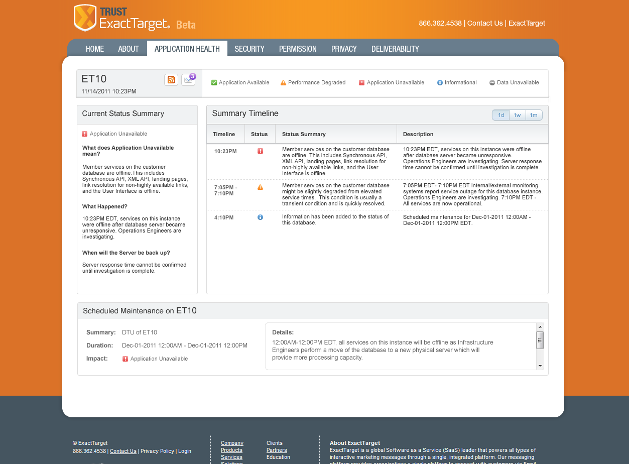
The current site was just a basic grid showing DB statuses. There was poor and unclear messaging to users about outages or scheduled/unschedule maintenance, unclear statuses and icons, poor search/filtering capabilities. There was no context or information about the site, what it was for or how users could use it to make informed decisions about a failure or issue with one of their systems. It was definitely time for a redesign and with the new branding initiative underway, it was the right time. This project was initiated by the Product Operations team as part of an overall effort to improve customer communications during scheduled maintenance windows and better messaging for system status.
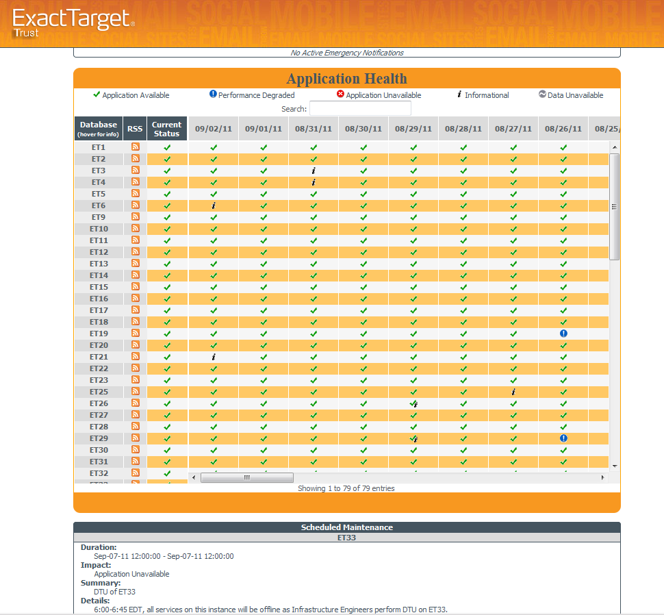
Original state of the site before starting designs
CONCEPTING
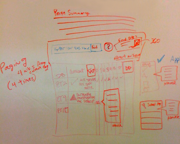
Early sketches for some of the grid issues around search/filter, paging, contextual help and messaging display
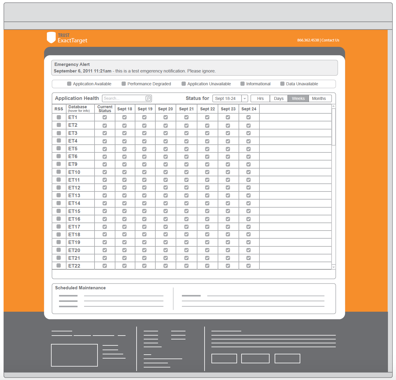
Illustrator Concept WFs for the system health grid, filtering, information display and hover information.
USER TESTING
I began designing more refined WFs and prepping with my researcher for user testing. I created an Invision prototype as a click-through of the screens for users. We tested three different flows to help us understand user needs and behavior.
THINGS WE WERE LOOKING FOR
Why they were visiting the site. What information they were looking for.
What actions they needed to take. Nice to haves/desires etc.
If a custom Trust branded login would feel more secure.
If the new landing page and about pages were helpful.
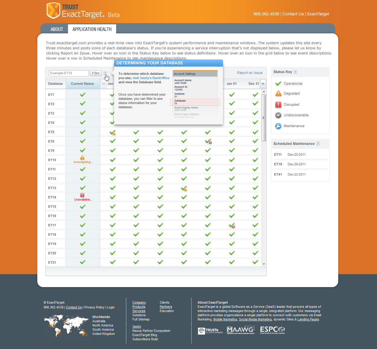
If our improvements to the system DB grid were helpful. Could users locate their DB easily and if they understood status and information on the screen.
If messaging and notifications were helpful, meaningful and actionable.
Why they were visiting the site. What information they were looking for.
What actions they needed to take. Nice to haves/desires etc.
If a custom Trust branded login would feel more secure.
If the new landing page and about pages were helpful.
If our improvements to the system DB grid were helpful. Could users locate their DB easily and if they understood status and information on the screen.
If messaging and notifications were helpful, meaningful and actionable.
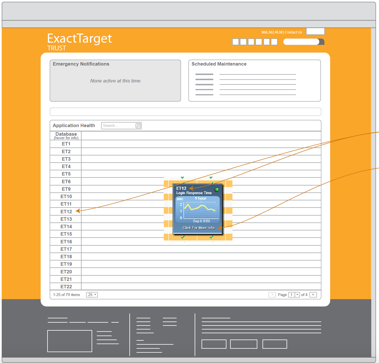
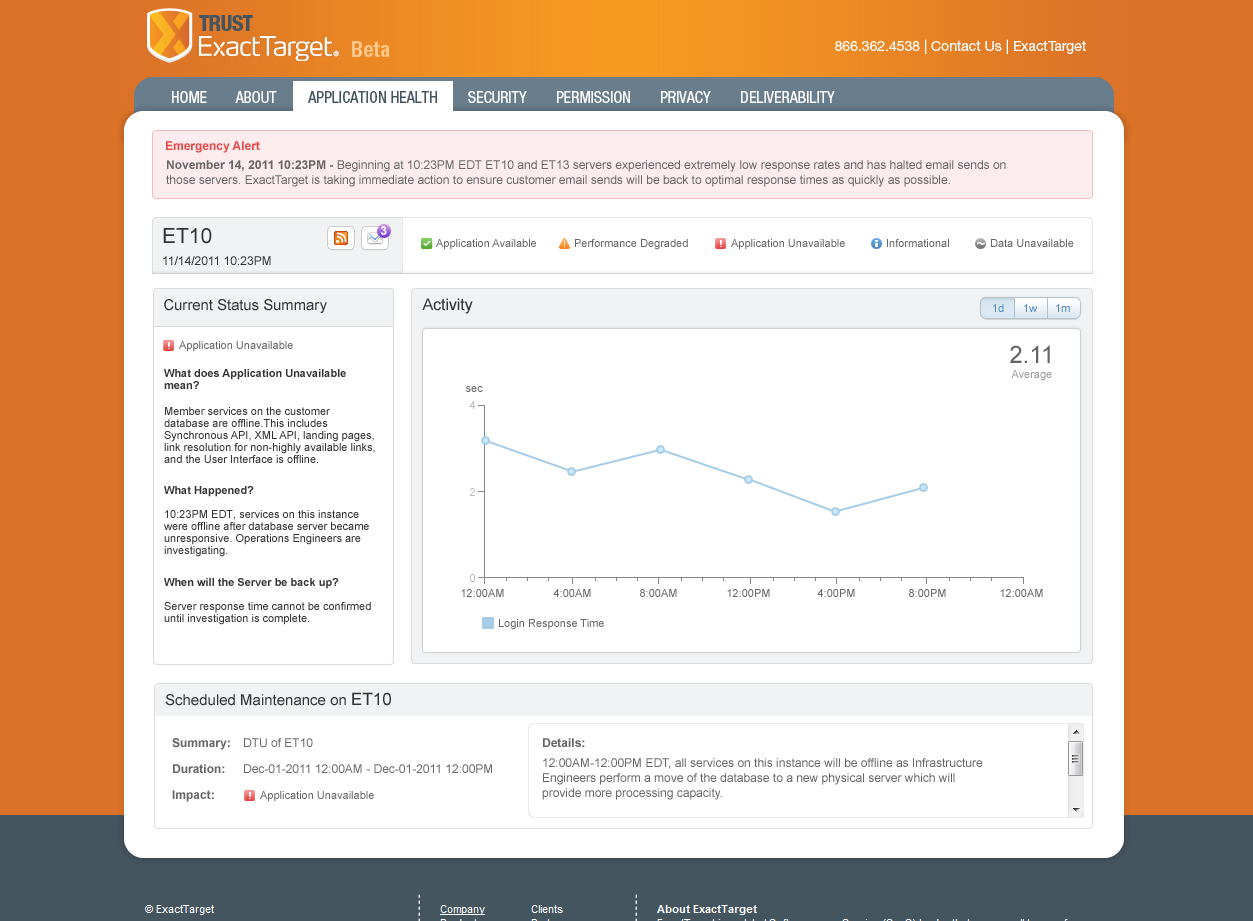
Visual Design detail view from the prototype showing user's specific DB and information. User's loved this view and preferred it over seeing all other system DBs in the grid view.
FINDINGS
Our users did prefer the custom login page for added security (it felt more secure and more seamless as anticipated). They didn't want to have to go somewhere else to locate their DB name and then come back and search for it in the list of DBs (anticipated behavior). Instead, they suggested displaying our new DB Detailed View upon login taking them right to their DB (also anticipated). Messaging and notifications for maintenance/downtimes still needed more work - each message needed to be standardized and crafted better. Status icons were better but we still needed improvements for the descriptions for each of them. We got feedback on terminology for status and suggested changes. We still needed improvement on overall contextual help and hover messages.
ITERATING FEEDBACK INTO FINAL DESIGNS
I began finalizing visual designs and worked with my developer on implementation strategy and a member from user assistance on crafting better messages. We worked to improve things like: contextual help, standardization of error messages and maintenance messages, improved status labeling and descriptions, and overall body copy for the about and landing pages. I also made a final pass on refining our status icons to be more recognizable and meaningful.
I then used Adobe Dreamweaver to create html template pages that my developer could use to build out the functionality and begin to wire it up.
IMPLEMENTATION
Actual implementation of the site ended up getting scaled back to just include some of our enhancements to the grid due to shifting of priorities after the acquisition of ExactTarget. Today the site has been retired but similar functionality has been grafted into the larger family of Salesforce Products on the Salesforce Trust site.